
Not so long ago, calculated priorities at 1st things 1st were displayed together with Radar charts. Was it the best visual representation for the priorities? Or is there anything better for your needs? Something more obvious, customizable, and intuitive?
Radar charts are the past
Radar charts (sometimes called Spider charts) are great for multidimensional comparisons. You have the complete overview at the fingertips and can compare the different items, side by side. Some radar implementations even suggest comparing different things with different dimensions on different layers of the same graph.
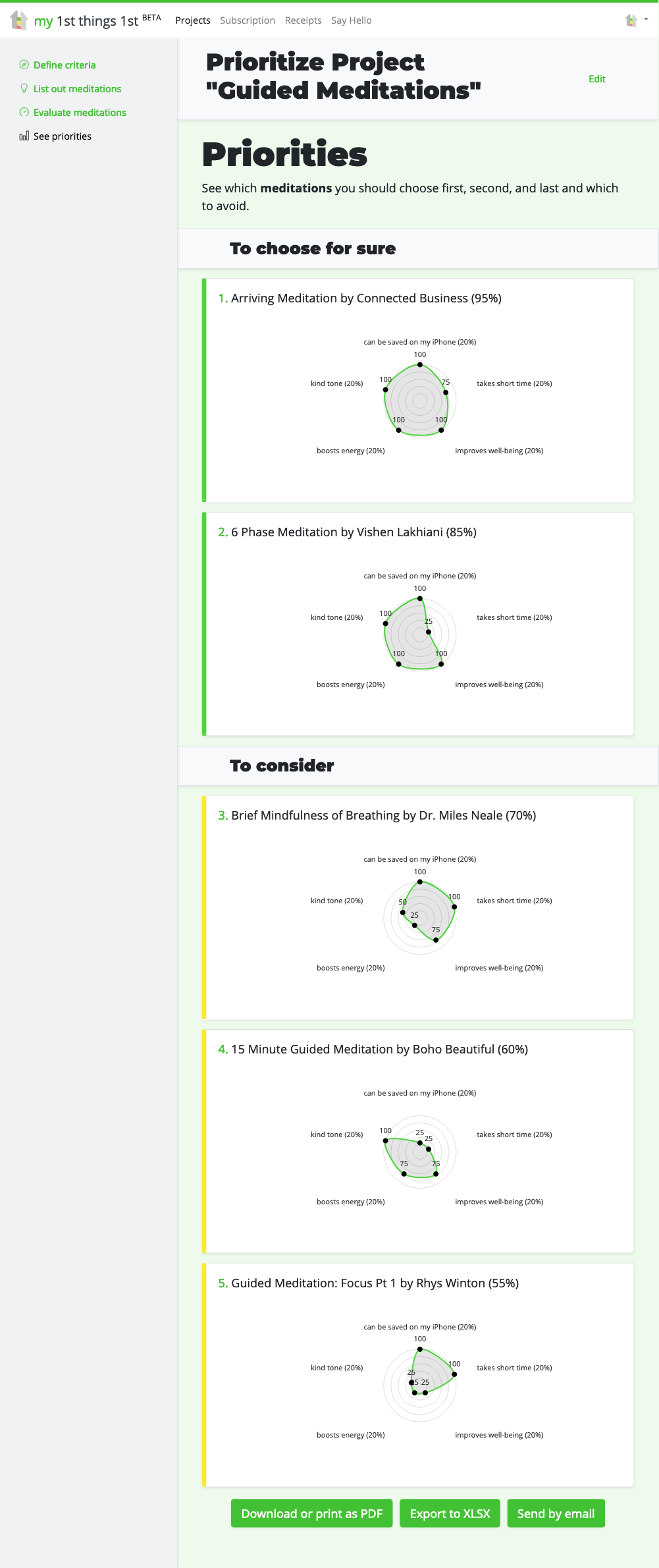
But Radar Charts are the past. At least for the 1st things 1st. Because they have these drawbacks:
- They don’t work well with less than 3 or more than 6 dimensions. In those cases, the best what I could think of was to replace them with Bar charts.
- If you have different weights for different dimensions, you couldn’t properly represent them in the chart.
- If the names of the criteria are long, they don’t fit into the dedicated space and make the chart very clumsy and fragile at the same time.
I did some googling and found another type of chart that could work. It was a Polar Area Chart. It’s like a Pie Chart with arcs of the same angles, but different radiuses representing the differences. I believed that with some slight modification, I could achieve even better results.
Aster Plot charts for the win
Some more time researching passed, and finally, I found what I had in my imagination – a rarely used chart which they call Aster Plot chart. Aster Plot Chart is a combo of the Polar Area Chart and Donut Chart.
Reading Aster Plot charts is simple. The more the donut is filled with color, the closer to 100% is its total score.
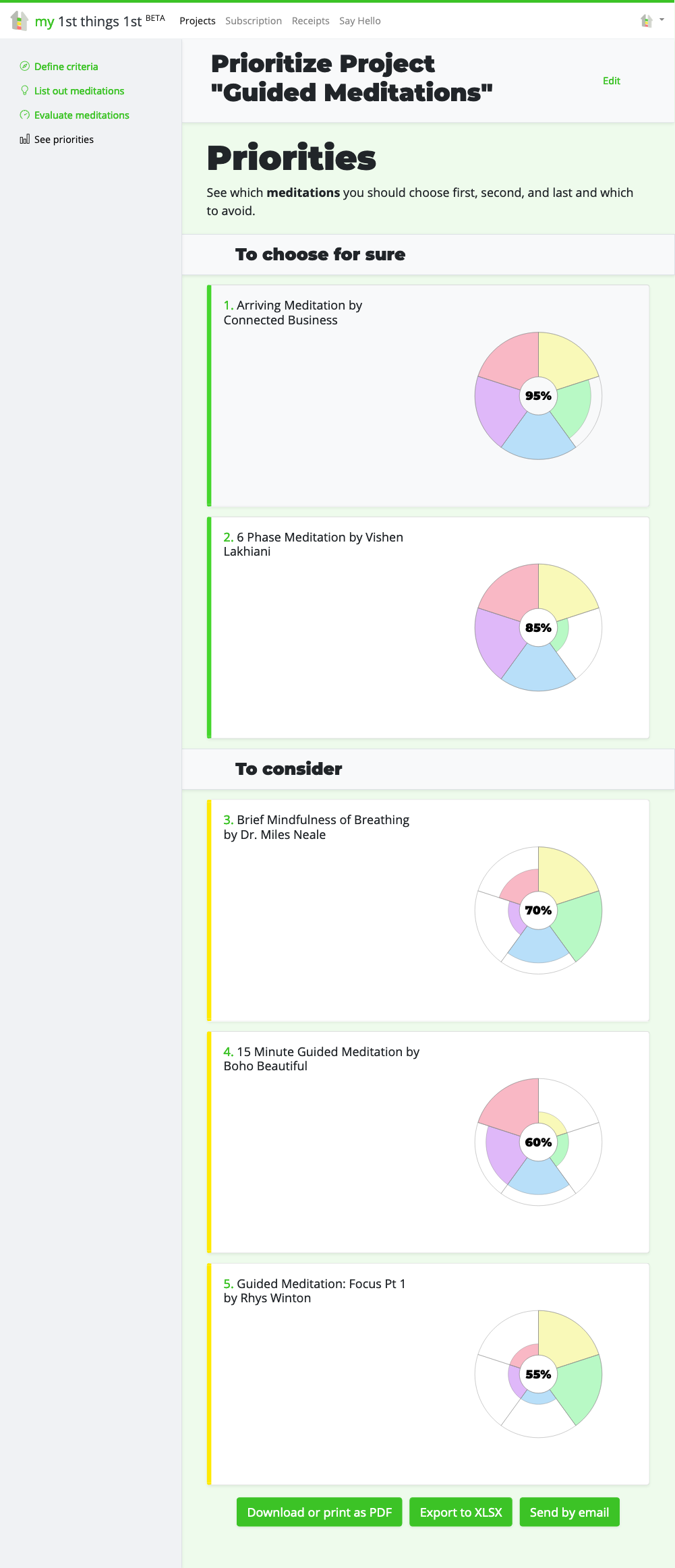
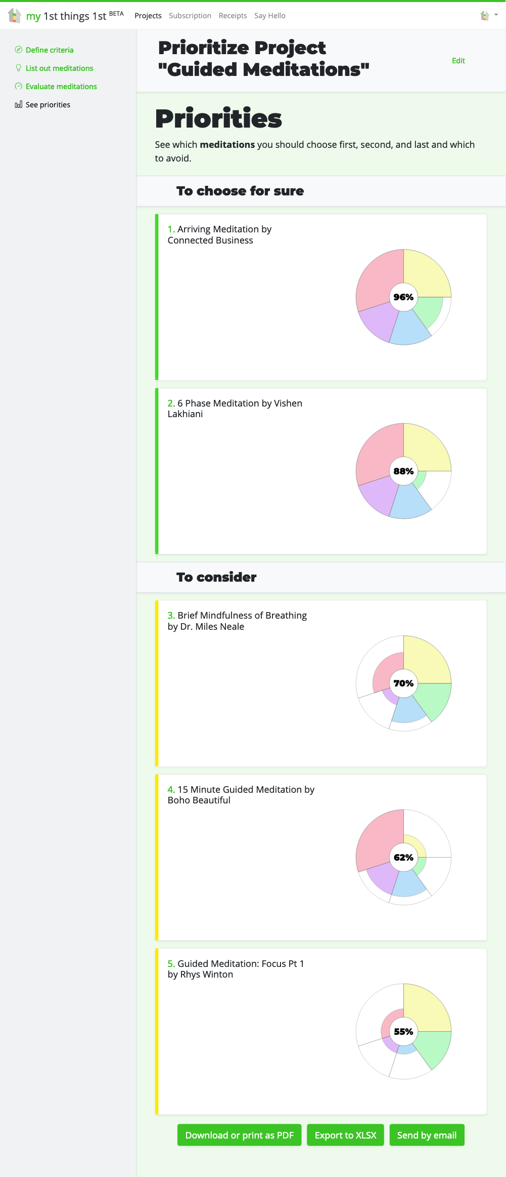
With the Aster Plot chart, you can not only show different dimensions with any amount of them. You can also represent different weights for those dimensions.
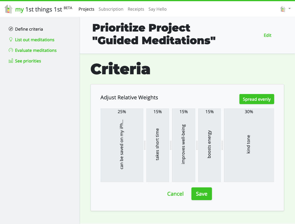
For example, if we adjusted the relative weights for our criteria, the Aster Plot charts would show arcs of different angles for each weight, and different radiuses for each score.
The names of the criteria are not gone. They are shown as tooltips on mouseover. And you can have as long names as necessary. I will just need to improve the accessibility by keyboard someday.
Introducing 1st things 1st, the ultimate solution for making complex decisions with ease.
With intuitive and smart prioritization tools, you can confidently prioritize options based on your personal preferences and assess them from multiple angles. Customizable templates allow you to align your priorities with your goals, while our AI-powered autosuggestion and fast evaluations equip you for confident and informed decisions.
Don’t struggle with analysis paralysis –
unlock the full potential of your decision-making with 1st things 1st.
Final Words
When creating something innovative and crazy, you can be surprised that other people have already analyzed some steps of your path. Just do some googling, reading, and evaluation, and you’ll find ways that you had never taken or thought. And you’ll learn the vocabulary that you are missing.
Innovation is an original combination of what is already known. And if you haven’t already, try the first of a kind strategic prioritizer 1st things 1st.
Cover photo by Jason Coudriet